Decoration Management
1 Introduction
Through this manual, you will learn about the decoration management functions in the POS ordering system and its core application scenarios. It covers the full range of operations such as navigation bar Decoration, table page layout, order page style, and custom navigation page design.
2 Basics of Decoration Management
2.1 Core Concepts
-
Decoration Scheme: A configuration template that controls the POS interface style. It is divided into【Group Preset Template】(used uniformly by the brand) and【Store Custom Scheme】(for personalized store adjustments).
-
Page Types:
- Fixed Pages: Structure is fixed, only style adjustments are allowed (e.g., Table Information Page, Ordering Page)
- Free Pages: Support component drag-and-drop layout (e.g., Custom Navigation Page)
-
Components: The smallest functional unit in decoration (e.g., “Store Info Component”, “Quick Order Button”, “Time Component”), allowing for adjustments in size, color, and position
-
Layers: Functional partitions within a page (e.g., “Title Area”, “Warning Info Area” on the Table Page). Used for precise positioning and styling of corresponding areas
2.2 Priority of Decoration Plan
- Store Custom Scheme (individually configured by store) > Group Pre-set Template (distributed by brand) > System Default Style
- The scheme takes effect immediately after being published, and the latest decoration effect is loaded upon POS restart
- History versions can be saved and rolled back to previous configurations (Path: Decoration Plan → History Versions → Clone as New plan)
3 Core Decoration Functions (Administrator Core Processes)
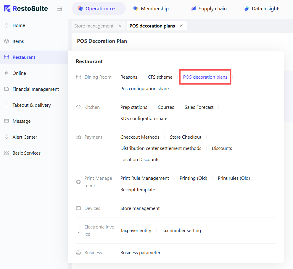
3.1 Navigation Bar Decoration
3.1.1 Access the Configuration Page
Log into the BO end (or POS main menu:【Settings → Decoration Management → Navigation Bar Settings】) and select【Navigation Bar Mode】to enter the configuration interface.
3.1.2 Choose Navigation Bar Mode (4 Options)
Fixed Menu: For stores with stable functionality (e.g., full-service restaurants)
The major function buttons are fixed on the left or top of the POS. You can adjust font size (default bold 30) and color.
Drawer Menu: For a clean interface (e.g., fast-food restaurants)
The main functions are hidden in a side drawer and expanded when clicked. Configure "Permanent Quick Functions" (like screen lock, shift closing).
Navigation Page: Centralizes function entry points (e.g., multi-operation stores).
The default landing page after login showcases custom components (e.g., Quick Order, Order Hub).
Fixed + Navigation Page: Combines fixed entry and flexible layout.
Retain a fixed main function bar while enabling a navigation page, supporting "Default Landing Page After Login" configuration (Order Page / Navigation Page).
3.1.3 Customize Main Functions (Trim and Sort)

- Access【Navigation Bar Settings → Customize Main Functions】and choose the view (Fixed Menu / Drawer Menu).
- Function Trimming: Check the main functions to display (mandatory: Tables / Quick Order, Settings; optional: Members, Gift Cards, Reports, etc.). Unchecked functions will be hidden.
- Function Sorting: Long press function items to drag and adjust the order (e.g., move “Quick Order” to the top for frequent access).
- Permanent Quick Function Configuration: Check “Screen Lock,” “Minimize,” “Shift End,” etc., to fix them at the bottom/top of the POS for easy access without entering the main menu.
3.2 Table Page Decoration (Manage Table Interface)
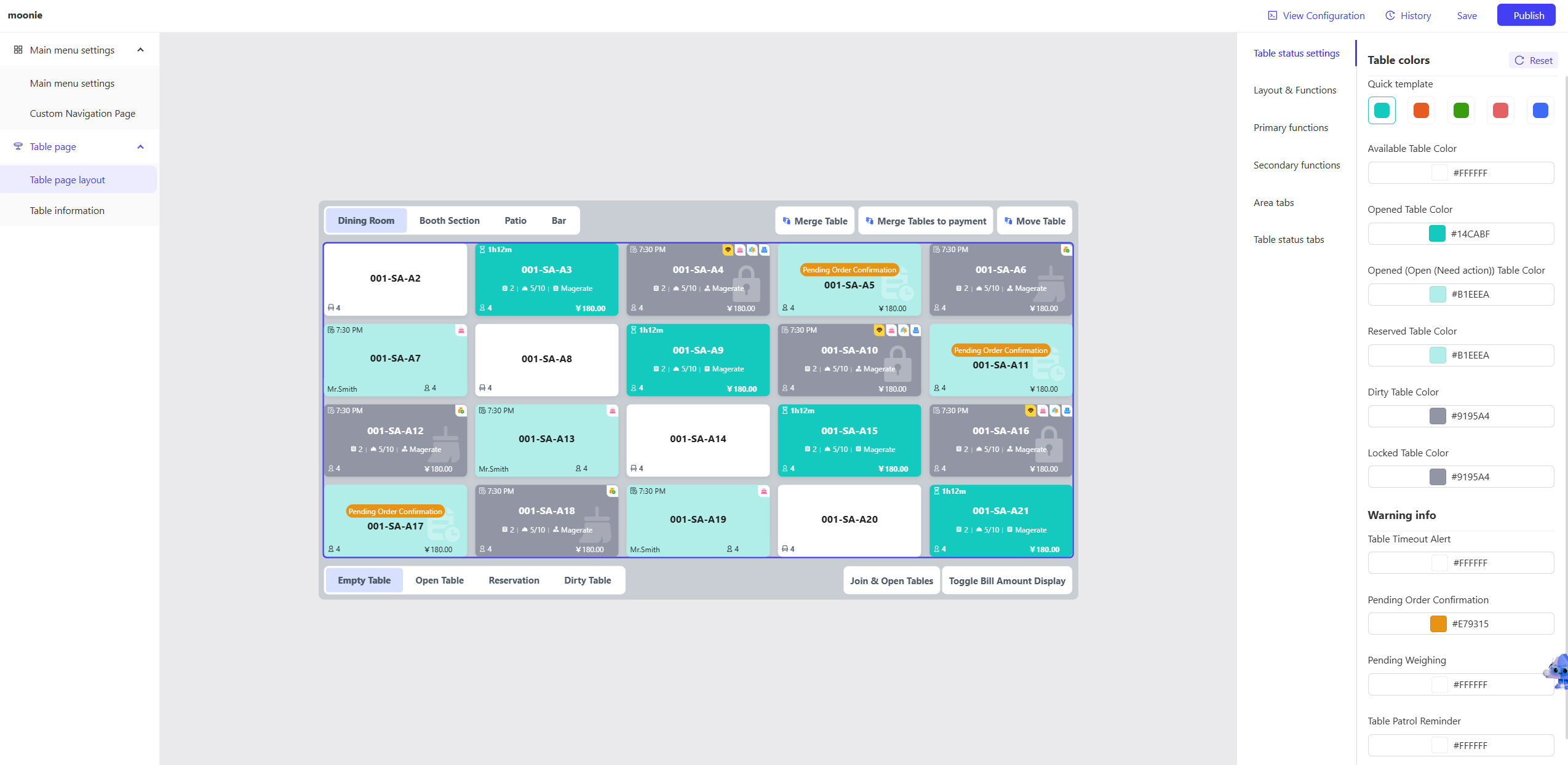
3.2.1 Table Layout Configuration (List / Floor Plan Mode)
Access “Decoration Management - Table Page - Table Page Layout” to select layout mode:
-
List Mode: Displays in “Area - Table” hierarchy (e.g., “Main Dining - Table 1,” “Booth Area - Booth 01”).
-
Floor Plan Mode: Simulate the actual store layout, allowing table repositioning.
-
Configure Functional Areas:
- Main Functional Area (Top Left / Top Right): Select frequently used functions (e.g., Join Tables, Transfer Table, Open Cash Drawer); displays up to 3, others fall under “More.”
- Secondary Functional Area (Bottom Left / Bottom Right): Configure auxiliary functions (e.g., “Join Table Open,” “Toggle Bill Amount Display”).
-
Table Color Settings:
- Configure colors by status (e.g., Empty Table: Green, Occupied: Blue, Dirty: Orange, Reserved: Purple).
- Use “Quick Templates” (e.g., “Tea Shop Template,” “Full-Service Template”) for quick color application.
3.2.2 Table Information Display Configuration
Access “Table Page - Table Information” and select the layer to configure (e.g., “Title Area,” “Warning Info Area”).
-
Configure Display Content:
- Title Area: Select fields to display (Table Name, Table Code, Area Name, Opening Time), adjust font size (default 24) and color.
- Warning Info Area: Select statuses to alert (Birthday Guests, Members, Order Urgency), set warning icon color (default red).
-
Example Configuration:
- For occupied tables, the title area displays “Table Name + Opening Time,” and the warning info area shows “Member Icon + Order Urgency Icon.”
3.3 Order Page Decoration (Order Operation Interface)

3.3.1 Access the Configuration Page
Enter【Decoration Management → Order Page】and use the left layer navigation to select the functional area to configure (e.g., “Shopping Cart,” “Product Area”).
3.3.2 Core Configuration Items
-
Shopping Cart Configuration:
- Width Setting: Choose proportion (30%/40%, default 30%) to control the display width of the shopping cart on the order page.
- Status Markers: Configure product status color (Not Ordered: Gray, Ordered: Black, Returned: Red); returned items can have “strikethrough” enabled.
- Summary Information: Set display fields (Subtotal, Taxes, Discounts) and adjust font size (summary line default bold 46).
-
Product Area Configuration:
- Menu Grouping: Set grouping rows (1-2 rows) and row height (default 40px), and select “Show Recommended Menu Group” (e.g., “Best Sellers”).
- Product Buttons: Choose “Image + Text” or “Text Only” mode, customize button background color (default white) and font color (Product Name 36, Price 18).
-
Modifier Area: Choose display position (left/below/right of product buttons), set columns (2-4 columns, default 3).
-
Custom Function Buttons:
- Table Order Mode: Configure order page bottom function keys (e.g., “Send to Kitchen,” “Cancel Order,” “Modify Product”).
- Quick Order Mode: Add【Dine-In / Takeout / Pickup】quick buttons, allowing size and color adjustments.
3.4 Custom Navigation Page Design (Free Layout Pages)

3.4.1 Access the Design Page
Enter【Decoration Management → Custom Navigation Page】with the left as the “Component Library,” the middle as the “Canvas Area” (24 columns ×16 rows grid), and the right as the “Property Configuration Area.”
3.4.2 Core Design Steps
-
Choose Template: From the canvas area top, select a pre-set template (e.g., “Fast Food Template,” “Full-Service Template”), which includes default component layouts (e.g., “Store Info + Quick Order + Order Center”).
-
Add Components: Drag components from the left component library to the canvas:
- Main Function Components: E.g., “Tables,” “Members,” “Reports,” initial size 3×3, can scale to 8×8.
- Quick Order Components: E.g., “Dine-In Order,” “Takeout Order,” allowing one-click navigation to the corresponding order page.
- Mini Components: E.g., “Store Info” (showing store number, version), “Time Component” (showing date and time).
- Navigation Components: E.g., “Pager,” “Navigation Dots,” used for multi-page switching.
-
Adjust Component Properties:
- Select a component, configure properties on the right (e.g., modify store name font color, background color for “Store Info Component”).
- Drag component edges to resize or reposition (aligning within the grid, no overlaps).
-
Multi-Page Setup:
- Click ”+”, add a new page (e.g., “Page 2”), allowing different component layouts.
- Add a【Pager Component】for inter-page switching (e.g., Page 1 for “Quick Order,” Page 2 for “Report Query”).
-
Save and Publish: Click【Save】to store configuration as a draft, confirm effects, then click【Publish】The POS will load the new navigation page upon restart.
4 Specialized Configuration Guide (Personalization Needs)
4.1 Multi-language Adaptation (For Brands Across Regions)
- Access【Decoration Management - Multi-language Settings】, choose the target language
- Configure Interface Text:
- Fixed Text: Automatically translated by the system (e.g., “桌台” to “Table,” “点单” to “Order”).
- Custom Text: Enter brand-specific terms manually (e.g., “卡座” to “Booth,” “露台” to “Patio”).
- Preview Effects: Check text adaptation after language switch to ensure no truncation or misalignment.
4.2 Brand Visual Uniformity (LOGO and Color Scheme)
- Background Color Configuration: Enter page Decoration (e.g., Navigation Page, Order Page), select “Page Background,” set color (e.g., brand primary color #DCDEDC) or upload background image (support JPG/PNG, size ≤ 2MB).
- Add LOGO: In【Custom Navigation Page】, add【Image Component】, upload brand LOGO, adjust size (recommended width ≤ 6 columns), fix at the top left of the page.
- Unified Button Style: All functional buttons (e.g., Quick Order, Table Buttons) uniformly set “Round Corners” (default 5px), “Background Color” (brand secondary color), and “Font” (Microsoft YaHei).
5 FAQs
5.1 Related to Decoration Configuration
-
Issue: Unable to place the component after dragging
- Check if component size exceeds canvas grid (e.g., minimum 6 columns, cannot place from column 20-24)
- Remove other components from the target position (no overlapping)
- Refresh the page and drag again.
-
Issue: No effect after publishing on POS
- Confirm template is “Published” (draft state doesn’t take effect)
- Restart the POS terminal to load the latest configuration
- Check template priority (whether store template overrides group template).
-
Issue: Table colors not displaying
- Access【Table Page → Table Color Settings】, confirm status and color binding correctly (e.g., “Dirty Table” bound to orange)
- Check if the table status is correct (e.g., “Dirty Table” needs manual marking)
- Clear the POS cache and re-login.
5.2 Related to Personalization Needs
-
Requirement: Hide less-used functions
- Enter【Navigation Bar Settings → Customize Main Functions】uncheck functions to hide (e.g., “Stock Management”)
- After publishing, the POS main menu will no longer display the function.
-
Requirement: Adjust font size (for large screens)
- Enter the corresponding page Decoration (e.g., order page), select the text area to adjust (e.g., product name)
- Change font size from default 36 to 48, preview for no truncation before publishing.
-
Requirement: Add new quick function buttons
- Enter【Custom Navigation Page】, drag “Quick Function Component” to the canvas
- Configure button name (e.g., “Damage Report”), icon (select system pre-set icon), and navigation path (link to “Damage Management”)
- Save and publish.
6 Verification and Rollback of Decoration Effects
- Effect Preview: During Decoration, the canvas area displays real-time effects. You can toggle to【Preview Mode】(simulating POS actual display).
- Rollback to Historical Versions:
- Access【Decoration Plan → Historical Versions】, select the version to roll back (showing release time and configurator).
- Click【Clone as New Plan】,modify and publish to override current configuration.